Org Chart vs. Organizational Structure: What's the Difference?
People use the terms interchangeably, but they're not the same thing. One is a picture; the other is the system the picture is trying to describe — and confusing them is where most reorganizations quietly fail.
Ask ten leaders the difference between an org chart and an organizational structure, and most will pause. The two terms get used interchangeably: "let's redo the org chart" usually means "let's change how we're organized." But they are not the same thing, and the gap between them is where a lot of reorganizations quietly fail.
An org chart is a picture. An organizational structure is the system that picture is trying to describe. You can redraw the picture in an afternoon; changing the system takes months. Mistaking one for the other is how companies announce a "reorg," move some boxes around, and discover six months later that nothing actually changed.
A reorg that changed nothing
A founder told us about the reorg they were proudest of — until it didn't work. They'd spent a weekend redrawing the org chart: cleaner reporting lines, two new team leads, tidy boxes. They announced it Monday. "Three months later," they admitted, "the same three decisions were still landing on my desk, the new leads were still checking everything with me, and the only thing that had really changed was that people were confused about their titles." They'd updated the picture. The structure (who actually got to decide) was exactly where it started.
That's the whole lesson in one story. Redrawing the chart felt like change and delivered none, because the chart was never the thing holding the company back.
The short answer
- Organizational structure is how the work, authority, and information of a company are actually arranged: who decides what, who is accountable for what, how teams coordinate, and how decisions and information flow.
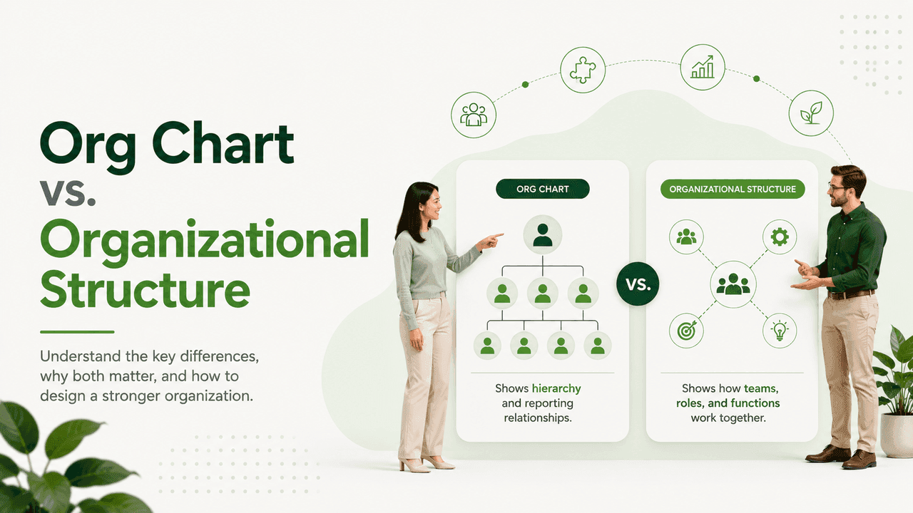
- An org chart is a visual representation of one slice of that structure, usually the reporting lines. It's a map, not the territory.
Structure is the operating model. The chart is a snapshot of part of it.
What is an organizational structure?
Structure is the company's operating system: the set of mostly-invisible arrangements that determine how work gets done at scale. It has several dimensions, only one of which a typical org chart shows:
- Grouping (departmentation) — how people are clustered into units: by function, product, customer segment, geography, or a hybrid.
- Reporting lines — who reports to whom. This is the part the chart usually captures.
- Decision rights — who actually gets to decide what: who can approve a hire, sign a contract, kill a project, set a price. Often not the same as the reporting line.
- Span of control — how many people report to each manager, which shapes how much real autonomy teams have.
- Accountability — who owns the outcome when something succeeds or fails.
- Coordination mechanisms — the meetings, rituals, shared metrics, and processes that let separate teams act as one company.
A reporting line tells you who someone's manager is. It tells you almost nothing about who makes the decisions, who owns the result, or how two teams actually get aligned. That's the part of the structure no chart can show.
Two companies with identical org charts can operate completely differently: one where managers hold real authority, one where every decision routes to the founder. Same picture, opposite systems. This is a well-established point in organizational design: an organization's real structure lives in its decision rights and accountabilities, not in its reporting diagram.
What is an org chart?
An org chart is a communication tool. Its job is to make one aspect of the structure legible at a glance, usually "who reports to whom." A good chart answers questions fast: who runs this team? who would I escalate to? how big is that department? That's valuable. But be clear about what a chart shows and what it hides:
What it shows
- Formal reporting relationships
- The shape of the hierarchy (tall vs. flat)
- Team sizes and groupings
- A rough sense of seniority
What it hides
- Where decisions actually get made
- The informal networks people really use to get things done
- How teams coordinate across the lines
- Accountability when work spans multiple boxes
- Whether the structure even matches how the company operates
This is why a chart can look perfectly tidy while the organization underneath it is a mess, and why a slightly messy chart can sit on top of a company that runs beautifully.
Side by side
| Organizational structure | Org chart | |
|---|---|---|
| What it is | The actual operating system of the company | A picture of part of that system |
| Captures | Authority, decision rights, accountability, coordination | Reporting lines and grouping |
| Changes | Slowly — it's behavior and process | Quickly — it's a diagram |
| Lives in | How people actually work | A slide, a wiki page, an HR tool |
| Fails when | Decision rights are unclear or misaligned | It no longer matches reality |
The same chart, different structures
Here's the contrarian part most reorgs miss: the same boxes-and-lines chart can represent completely different structures. The common types:
- Functional — grouped by discipline (all engineers together). Efficient and clear, but cross-functional work needs deliberate coordination.
- Divisional — grouped by product, market, or region, each with its own functions. Faster and more autonomous, but duplicates effort and can fragment culture.
- Matrix — people report along two axes (e.g., a function and a product). Powerful for complex work, but decision rights have to be crystal clear or it produces gridlock.
- Flat / flatarchy — few layers, wide spans, lots of autonomy. Fast early on; coordination gets harder as headcount climbs.
- Network / team-of-teams — small autonomous units coordinating around shared goals. Adaptive, but depends heavily on strong shared culture and principles.
These can produce nearly identical charts. A matrix and a functional org often look the same on paper. The difference lives in the decision rights and accountability: the structure, not the picture.
Why is confusing an org chart with structure expensive?
When leaders treat the chart as the structure, predictable failures follow:
- Reorgs that change nothing — boxes move, titles change, a new chart ships, but decision rights and accountability stay put. (Our founder's weekend reorg.)
- Hidden bottlenecks — the chart says a manager owns a team, but every real decision still routes through the founder. Nothing was actually delegated.
- Accountability gaps — work that spans several boxes has no clear owner, because the chart only describes vertical lines, not horizontal ownership.
- Structure debt — the chart is updated; the way people work isn't. Over time the picture and the reality drift so far apart the chart becomes actively misleading.
How do you design organizational structure the right way?
Design the structure first, then let the chart describe it, not the other way around:
- Start with the work and the strategy. What must the company be good at? Which decisions must be fast? That defines how to group and where authority should sit.
- Define decision rights and accountability explicitly. For the roles that matter, write down who decides, who's consulted, and who owns the outcome. This is the real structure.
- Then draw the chart as an honest summary of that, and keep it updated as reality changes, so it never becomes a comforting fiction.
Ask yourself
- For your three most important recurring decisions, can everyone name who actually decides?
- If you redrew your org chart tomorrow, would anything about how decisions get made change?
- Where does work routinely fall between the boxes with no clear owner?
- Does your chart describe how the company really runs, or how you wish it did?
The takeaway
The chart is downstream of the structure. Get the structure right (grouping, decision rights, accountability, coordination) and the org chart takes care of itself. Get it wrong, and the prettiest chart in the world won't save you. A beautiful diagram on top of unclear decision rights is one of the most common forms of organizational self-deception: it looks like clarity and behaves like chaos.